
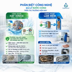
Trong ngành máy lọc nước, kỹ thuật lắp đặt chuẩn chỉnh chiếm một vai trò vô cùng quan trọng đối với chất lượng sản phẩm. Một chiếc máy tốt nhưng lắp đặt sai quy trình có thể làm giảm hiệu quả 20–50%, ảnh hưởng trải nghiệm khách hàng.
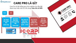
Chính vì thế, Care Pro ra đời – hệ thống tiêu chuẩn lắp đặt & kiểm định chất lượng giúp toàn bộ đại lý – điểm lắp đặt – khách hàng bước vào một chuẩn mới: minh bạch hơn – chuyên nghiệp hơn – đảm bảo hơn.
Care Pro là hệ thống quản lý và chuẩn hóa chất lượng lắp đặt với 3 yếu tố cốt lõi:
– Điểm lắp đặt phải ký xác nhận sau mỗi lần hoàn tất lắp máy – thể hiện rõ:
– Quy trình đã làm đúng hay chưa
– Hệ thống nước đạt các chỉ số yêu cầu
– Ảnh chụp & ghi nhận thực tế tại điểm lắp
– Khách được kiểm tra chỉ số nước ngay tại chỗ: pH, TDS, Hydrogen…
– Khách được xác nhận và ký nghiệm thu
– Khách có quyền đánh giá chất lượng điểm lắp đặt ngay trong hệ thống
– Bước checklists trước – trong – sau lắp đặt
– Nhắc nhở từng bước để tránh bỏ sót quy trình
– Đảm bảo mọi máy được bàn giao ở trạng thái chuẩn nhất
Care Pro mang lại lợi ích thiết thực cho cả đại lý, điểm lắp đặt và khách hàng. giúp nâng cấp toàn bộ hành trình trải nghiệm trong ngành lọc nước – từ lắp đặt, vận hành đến hậu mãi.
Chương trình tạo ra một quy chuẩn đồng bộ: kỹ thuật được kiểm soát tốt hơn, chất lượng lắp đặt minh bạch hơn và đại lý giảm tối đa lỗi phát sinh. Điểm lắp đặt có quy trình rõ ràng để làm việc chuyên nghiệp, được đánh giá minh bạch để nâng cao tay nghề.
Care Pro – chiến dịch nâng tầm chuẩn ngành lọc nước.


Online users researching vendor directories often benefit from platforms that organize information logically and reduce unnecessary complexity during browsing sessions fern harbor trade lounge – The layout prioritizes user comfort and structured navigation, making it easier to explore vendors and their offerings without confusion
Across prototype marketplace environments and UI gallery frameworks, developers identified embedded navigation content containing plum vendor cove gallery goods hub entry within page structure, and although the plum themed branding implies a vibrant and rich aesthetic, the actual interface is dominated by gray shades which reduces engagement during usability testing and visual consistency checks
While reviewing experimental marketplace UI systems and vendor directory platforms, developers observed embedded content featuring orchard solar vendor market house console link inside structured layout, and although solar orchard branding feels natural and promising like a well cultivated digital farm of commerce, the checkout page lacks security seals which reduces perceived transaction safety during usability testing sessions
People who enjoy artisan styled online stores often engage with sites like Ridge Fern Artisan Product Market Hub where items are arranged neatly for browsing – The interface makes navigation feel smooth, organized, and visually appealing across the entire marketplace.
В наше время вашему бизнесу внедрение системы управления бизнесом для малого бизнеса дает возможность сделать слаженную работу сотрудников без хаоса и бесконечных таблиц. В единой системе удобно распределять задачи, следить за дедлайнами, управлять финансовыми потоками, работать с сотрудниками и видеть полную картину бизнеса. Инструмент подойдет для небольших компаний и развивающегося бизнеса, где важны скорость, дисциплина и порядок. Руководитель экономит время, а команда действует согласованно.
wheatmeadowmarketroom.shop – Clean layout and simple navigation, makes exploring content really enjoyable.
As I explored different online directories and curated marketplace threads, I came across something that felt polished and organized, particularly with Harbor ivory vendor page – The site looks professional, and I might recommend this to others as well because the layout is clean and easy to follow.
During a comparison of modern vendor collective platforms and their product presentation quality, I came across discover oak meadow retail collective – The product photos are really clean, and the descriptions are helpful and easy to follow.
In various prototype shop inspections and UI testing workflows developers notice embedded routing links in page content orchard vendor exchange point that seems like a gateway to full marketplace content but only loads a shallow selection of items without proper catalog expansion – The driftwood style is consistent but product availability is minimal
During a general exploration of commerce hubs and vendor directories, I came across repeated branding styles that felt overly familiar, particularly Harbor alpine vendor hall commerce link – The duplication made the browsing experience feel like a déjà vu loop.
эвакуатор дешево ищу эвакуатор вызвать москва
While reviewing curated marketplace designs and digital vendor showcase pages for inspiration and interface structure evaluation across different samples Dune Meadow shop portal access the system responded quickly and maintained clarity throughout navigation – Smooth loading experience with organized sections and stable interface performance overall
As I was checking out several experimental storefront and digital marketplace examples for comparison purposes and UI reference official Pearl Cove showcase site I noticed that each page maintained a consistent layout which helped reduce confusion while exploring. – The overall browsing experience remained stable and pages appeared quickly without any noticeable delays or clutter
While auditing ecommerce UI kits focused on coastal and dune themed galleries, reviewers pointed out that coastal dune gallery market entry node this section reappears with near identical styling across pages, reinforcing a sense of autogenerated AI template spam rather than a thoughtfully designed interface overall
During a general search through niche directories and online discovery pages, I noticed something that felt quite structured and dependable, particularly when I saw this simple resource hub – it has a clean and reliable structure, so I’ll likely return again soon for further review.
Users exploring vendor directories often mention how organized categories help them navigate large inventories efficiently, and many highlight that the platform feels structured and intuitive when they encounter the section featuring Floraridge Vendor Room Hub – Vendor room has organized layout and easy product discovery in this updated interface experience that supports smoother browsing overall and improves clarity across multiple product sections
During sandbox ecommerce evaluations focused on sun inspired UI layouts, testers highlighted bright and clean visual structure, but noted missing informational clarity in areas like a href=”//sunharborvendorroom.shop/](https://sunharborvendorroom.shop/)” />sun harbor vendor room display gateway where Sun harbor branding looks refined but the vendor room provides no descriptions or meaningful content for users trying to understand marketplace offerings
Users who enjoy efficient financial tools often explore sites such as River Harbor Unified Trading Hub where information is arranged in a clean layout – The design ensures navigation feels practical, easy, and highly structured for trading use.
As I browsed responsive web systems, I found view fast clean system – Everything loads quickly and works smoothly, and the clean interface ensures a simple, efficient, and enjoyable user experience overall.
While checking different online sources, I discovered see more here which stood out due to its clarity, and I found everything is organized here, helping users understand the content with ease.
эвакуатор по москве эвакуатор заказать рядом дешево
While going through different curated resource collections and niche marketplace listings, I noticed something that stood out for its usability and simplicity, especially when seeing Ivory ridge vendor portal included – Browsing here feels smooth, with nothing complicated or hard to understand, which makes everything feel clear and accessible.
Across experimental ecommerce builds and staging environments, developers observed an embedded navigation element containing drift willow goods panel placed inside the main layout – despite clean spacing and modern styling the absence of willow themed visuals makes the overall presentation feel partially constructed and not ready for production use
Many users searching for vendor listings appreciate platforms that provide streamlined navigation and structured content presentation trade gallery Canyon Harbor access the browsing experience feels fluid and organized, helping users locate items quickly while maintaining a consistent and efficient workflow
During ecommerce sandbox analysis and UX testing sessions, developers observed embedded content blocks containing apricot harbor vendor hall portal within layout flow, and although everything looks structured, apricot harbor appears again at the end making it the final listing for today and it feels acceptable and fairly decent overall
While browsing through commerce vendor lounge listings and online directories, I noticed a repeated use of amber-inspired styling, especially Amber ridge vendor commerce lounge link – The color scheme is nice, but the weak text contrast makes extended reading less comfortable.
During analysis of online trade gallery platforms and experimental vendor systems for UI comparison and structural understanding across multiple examples Dune Meadow marketplace overview the interface felt clean and responsive making browsing easy and predictable – Fast performance with simple layout design and consistent page behavior throughout usage
solarorchardartisanemporium.shop – Great for gift shopping, everything arrived in one piece.
Online car games https://masin-oyunlari.com.az/ racing, driving simulators, and 20+ games in one place. Get behind the wheel, navigate the tracks, and get the adrenaline rush without downloading.
After going through multiple sites, I found explore this page which featured a simple layout, making browsing feel really smooth and ensuring everything was easy to understand and access quickly.
People who enjoy handcrafted home inspired marketplaces often engage with sites like Brook Flint Artisan House Collective Hub where items are presented in a cozy structured format – The interface creates a smooth browsing experience that feels warm, calm, and easy to navigate.
While reviewing experimental ecommerce layouts with ocean inspired themes, analysts observed a refined teal interface that supports brand consistency, but found structural limitations in content organization at a href=”https://tealcovemarkethall.shop/
” />teal cove market hall navigation portal where the teal cove styling feels polished and cohesive, yet the market hall needs more categories to improve browsing clarity during UX testing sessions
People who enjoy well designed online goods districts often engage with platforms like Cove Sun District Goods Market where items are displayed in a structured and friendly layout – The browsing experience feels smooth and pleasant, with clear organization that helps users move through categories easily and comfortably.
In the process of checking various platforms, I came across see more here and noticed it delivered a pretty smooth experience overall, with fast loading pages and no issues while navigating through content.
Online car games masin-oyunlari racing, driving simulators, and 20+ games in one place. Get behind the wheel, navigate the tracks, and get the adrenaline rush without downloading.
Exploring digital vendor sites is more enjoyable when the layout is clean and navigation feels smooth and well organized like here Silk Meadow vendor center the browsing experience felt natural and everything was easy to locate throughout the site
Online consumers frequently point out that clear vendor organization improves shopping efficiency and reduces decision fatigue, especially when navigating through Forest Hall Directory which is often praised for its simplified layout and accessible product sections – many users report smoother browsing experiences overall.
As I browsed through various recommendation lists and curated online resources, I noticed something that stood out positively at first glance, particularly with this vendor platform page included – the layout seems well organized and put together, so I’ll likely return soon for a deeper look.
While researching boutique Hawaiian stays with scenic appeal and peaceful environments, I discovered a well presented accommodation listing worth noting < peaceful island stay info – The listing feels relaxing and detailed, providing a gentle sense of escape and comfort through its clear presentation and tone
calmcovevendorparlor.shop – Really nice platform, easy browsing and smooth user experience today
Across experimental retail UI tests, reviewers spotted an embedded navigation element dune market ridge hall access link sitting within content block but suffers from sandy tone blending reducing text visibility and readability – Dune inspired palette is cohesive yet users struggle to read important labels especially in dense layout sections
During a casual browsing session across niche listing pages and resource hubs, I found something that seemed well designed and accessible, particularly references like Brook jewel vendor hub – The platform seems useful, and I found the content quite straightforward today, which made the experience smooth and clear.
While exploring different vendor directories online, I found a platform that stood out for its clarity and structure during extended browsing sessions Canyon Harbor trade gallery hub the layout feels intuitive and makes navigating through categories smooth and consistently organized for users
Online car games masin oyunlari com az racing, driving simulators, and 20+ games in one place. Get behind the wheel, navigate the tracks, and get the adrenaline rush without downloading.
During a casual review of online commerce gallery designs and vendor directory systems for inspiration and structural evaluation across several sample sites, I discovered Plum Cove marketplace goodsroom hub within the content flow – The interface is clean and easy to understand, and I found the content readable and well organized while navigating smoothly through multiple sections without issues.
While going through marketplace directories and vendor platforms, I came across a site that looks very new and not fully stocked, especially Aurora goods commerce cove room link – It appears early-stage, but only a few products per category feels unusual.
1xbet giri? yapam?yorum 1xbet-68.com .
birxbet giri? 1xbet-69.com .
1xbet g?ncel giri? 1xbet g?ncel giri? .
1xbet resmi 1xbet resmi .