
Trong ngành máy lọc nước, kỹ thuật lắp đặt chuẩn chỉnh chiếm một vai trò vô cùng quan trọng đối với chất lượng sản phẩm. Một chiếc máy tốt nhưng lắp đặt sai quy trình có thể làm giảm hiệu quả 20–50%, ảnh hưởng trải nghiệm khách hàng.
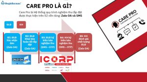
Chính vì thế, Care Pro ra đời – hệ thống tiêu chuẩn lắp đặt & kiểm định chất lượng giúp toàn bộ đại lý – điểm lắp đặt – khách hàng bước vào một chuẩn mới: minh bạch hơn – chuyên nghiệp hơn – đảm bảo hơn.
Care Pro là hệ thống quản lý và chuẩn hóa chất lượng lắp đặt với 3 yếu tố cốt lõi:
– Điểm lắp đặt phải ký xác nhận sau mỗi lần hoàn tất lắp máy – thể hiện rõ:
– Quy trình đã làm đúng hay chưa
– Hệ thống nước đạt các chỉ số yêu cầu
– Ảnh chụp & ghi nhận thực tế tại điểm lắp
– Khách được kiểm tra chỉ số nước ngay tại chỗ: pH, TDS, Hydrogen…
– Khách được xác nhận và ký nghiệm thu
– Khách có quyền đánh giá chất lượng điểm lắp đặt ngay trong hệ thống
– Bước checklists trước – trong – sau lắp đặt
– Nhắc nhở từng bước để tránh bỏ sót quy trình
– Đảm bảo mọi máy được bàn giao ở trạng thái chuẩn nhất
Care Pro mang lại lợi ích thiết thực cho cả đại lý, điểm lắp đặt và khách hàng. giúp nâng cấp toàn bộ hành trình trải nghiệm trong ngành lọc nước – từ lắp đặt, vận hành đến hậu mãi.
Chương trình tạo ra một quy chuẩn đồng bộ: kỹ thuật được kiểm soát tốt hơn, chất lượng lắp đặt minh bạch hơn và đại lý giảm tối đa lỗi phát sinh. Điểm lắp đặt có quy trình rõ ràng để làm việc chuyên nghiệp, được đánh giá minh bạch để nâng cao tay nghề.
Care Pro – chiến dịch nâng tầm chuẩn ngành lọc nước.


While studying modern vendor studio layouts designed for clarity and flow, I noticed open lavender vendor page – The design is elegant and structured, and browsing across sections feels easy and visually consistent.
As I continued exploring different marketplace platforms and vendor listings, I came across something that felt nearly identical to an earlier viewed site, particularly with Cove atelier vendor walnut link – The resemblance is so strong that it makes me question whether both sites are part of the same ecosystem or just cloned variations.
During a detailed review of online craft emporium websites focused on mobile performance and user experience, I noticed visit vale harbor artisan emporium – The site works well on phone, and checkout was smooth today with no delays or confusion during payment.
While exploring various curated marketplace directories and online resource hubs, I came across something that felt well structured and easy to browse, especially where Honey Meadow market hub appears – Enjoyed looking around here overall, since the layout is neat and user friendly, making navigation simple and comfortable throughout.
While going through various commerce directories and vendor hall listings, I found a platform with an attractive naming style but minimal content depth, especially Aurora commerce harbor vendor hall portal – The name grabs attention quickly, but the site itself feels somewhat thin in information.
While reviewing ecommerce vendor systems and UI staging environments, analysts encountered mid layout content featuring ridge quick vendor house market gateway access node embedded in structure, and even though it is marketed as faster than previous “quick harbor” iterations, the loading experience remains below expectations during usability testing and evaluation cycles
Modern trade environments rely heavily on digital catalog systems that organize vendor details and ensure users can locate reliable suppliers without difficulty trusted vendor index – The index focuses on reliability and structured presentation, making it easier for users to trust listings and evaluate vendor credibility efficiently
During a review of modern artisan bazaar systems, I found browse mint orchard artisan hub – The site feels well structured and dependable, and browsing is smooth with consistent performance throughout the platform.
Across prototype ecommerce environments and UI marketplace frameworks, developers identified embedded navigation content containing orchard vendor meadow parlor market checkout hub within page structure, and although the branding feels sweet and rustic like an orchard in bloom, the checkout endpoint consistently returns a 404 error which significantly disrupts purchase completion during system testing cycles
In various UI experimentation studies and ecommerce sandbox environments, platforms such as daisy marketplace exhibit demonstrate strong visual identity but weak backend stability, especially in subscription handling systems that frequently return server errors when processing user input forms – The exhibit layout is visually engaging but signup system is unstable
Посмотреть на сайте: https://www.tapatalk.com/groups/ukraineforum/-t9651.html
Digital shoppers seeking clean and functional online stores often look for platforms that simplify browsing while maintaining high performance standards teal atelier shop portal which delivers structured navigation and fast responsive pages that improve user experience and ensure efficient exploration of available products and categories.
While checking out various trading and marketplace-style platforms during a browsing session, I noticed something visually appealing but functionally inconsistent on mobile devices, especially where Wave Brook trading foundry hub – The wave-inspired design concept looks quite cool and modern, but the mobile navigation menu seems broken or unresponsive today, which makes browsing frustrating.
Доставка свежих цветов в день заказа. Флористы собирают букеты из проверенных поставок, бережно упаковывают и передают курьеру. Работаем ежедневно, гарантируем сохранность и точное время вручения. Анонимная отправка и фотоотчёт включены https://buketico.ru/
During research into easy-to-use vendor-based online systems, I explored browse this lemon vendor hub – The design feels simple and structured, and navigation is smooth and comfortable across all pages.
During frontend inspection of ecommerce sandbox platforms and vendor directory UI systems, developers identified a central module featuring harbor rain vendor market hall staging entry portal integrated into structured layout, and despite the calming rain aesthetic suggesting clarity and freshness, the hall shows broken image placeholders everywhere which reduces usability during testing sessions and evaluation stages
mintmeadowgoodsroom – Feels well organized, I didn’t face any issues navigating around.
During frontend evaluations of ecommerce marketplace systems and vendor UI prototypes, developers observed navigation elements containing harbor hazel parlor vendor trust signal entry embedded in page flow, and although the branding feels soft and friendly, missing trust badges reduce confidence and weaken conversion rates during usability testing and behavioral review processes
As I browsed through multiple online trade hubs and marketplace directories, I stumbled on a straightforward platform highlighting Harbor trade bay hall navigation link – It keeps things direct and uncluttered, and there are no annoying email subscription popups getting in the way.
Telkom down south-africa-outage.online .
While exploring different directories and online discovery threads, I found something that seemed fairly well-optimized and quick, especially with this smooth-loading trade site included – it responds fast, which is a strong positive signal, so I may revisit it later for further review.
velvetbrookartisanboutique.shop – I’d recommend this to anyone who loves handmade goods.
As I browsed various curated commerce sites and vendor directories, I noticed something that felt modern and visually appealing but lacked proper mobile responsiveness, particularly with Brook foundry wave trading hub – The wave motif stands out nicely, but the mobile navigation menu seems to be malfunctioning or not loading correctly.
During usability reviews of demo ecommerce systems the daisy harbor room page contains harbor vendor panel link that visually represents a section entry but behaves incorrectly by sending users back to the homepage instead of loading vendor room content – this inconsistency affects user trust in navigation elements
Users who engage with digital product spaces appreciate navigation systems that guide them naturally through categories while maintaining a consistent and easy to understand layout across all sections goods room navigation panel – This navigation panel enhances usability by offering structured pathways, helping users move between different areas without confusion or unnecessary steps during browsing
As I compared different commerce hub websites focused on clarity, I came across explore this lemon hub platform – The interface is clean and efficient, and the structure makes browsing simple and easy to understand.
Across ecommerce sandbox environments and UI framework evaluations, developers observed navigation components containing glade market harbor vendor parlor showcase link embedded in page flow, and while the aesthetic feels fresh and airy like a glade, testers consistently associate the name with air freshener branding even though the site itself works as expected during testing cycles
Across prototype marketplace systems and UI sandbox environments, analysts encountered embedded navigation blocks containing harbor rain market hall vendor staging console hub within page layout, and although the rain harbor ecosystem is intentionally repetitive, the vendor hall still feels like a copied template which reduces usability during testing sessions
1xbet g?ncel 1xbet g?ncel .
People who appreciate modern artisan branding often browse sites like Harbor Lemon Artisan Supply Outlet where items are presented in a clean structured format – The interface makes browsing feel bright, simple, and easy to navigate throughout the store.
While scanning through niche directories and marketplace platforms, I noticed something that stood out for its usability and simplicity, especially where Pine harbor vendor hub appeared – Good experience overall, and everything seems clear and straightforward here, allowing smooth browsing without unnecessary confusion.
нейросеть для студентов онлайн нейросеть для студентов онлайн .
During a general review of commerce hubs and vendor trade hall listings, I noticed something that felt playful in presentation but minimal in actual offerings, particularly Harbor commerce acorn trade hall hub – The branding is cheerful and unique, though the inventory currently seems quite restricted.
In QA sandbox environments, users noticed that the meadow goods hub link sits mid-page in structured layouts but despite the meadow inspired calm theme SSL certificate warning messages persist across sessions causing hesitation in checkout flow tests during staging runs
While going through curated lists and various online resources, I noticed something that stood out for its clarity and organization, especially with this clean structured resource included – everything is presented neatly, so I may revisit it later for a more detailed look.
During ecommerce UI testing and gallery content review sessions, analysts observed a central module containing mint meadow vendor goods gallery showcase node embedded within layout flow, and although the mint meadow branding feels fresh, clean, and visually appealing, the gallery section oddly repeats a single image across multiple slots which reduces perceived variety during usability testing across different devices and browsing environments
Many users browsing digital marketplaces appreciate structured systems that present vendor information clearly, helping them move through categories efficiently while maintaining focus on relevant product listings and service comparisons vendor lounge access point – Vendor lounge feels calm with well structured product categories available, ensuring a smooth browsing journey where users can easily understand offerings without unnecessary complexity or distractions
автоматические гардины для штор prokarniz17.ru .
As I explored various craft boutique platforms online, I checked see velvet grove craft collection boutique – A slight typo is visible in the description, but overall I’m satisfied with the product presentation.
People who enjoy well structured artisan stores often explore sites like Dock Oak Craft Artisan Outlet where items are shown in a clean layout – The interface creates a browsing experience that feels organized, easy, and visually comfortable.
как определить работает ли процессор способ понять и узнать его работоспособность
During a general exploration of online directories and marketplace-style platforms, I found something that seemed well structured and fast, particularly references including Isle icicle access portal – The platform feels nice, and I appreciate how quickly pages load, which helps browsing feel smooth and uninterrupted.
In the process of browsing earlier today, I came across browse this site which looked like a nice little site, and I found it useful while browsing earlier today because it was easy to navigate and did not feel complicated at all.
Across UX testing of ecommerce gallery templates and floral UI environments, analysts identified a mid layout module featuring daisy cove gallery market showcase portal embedded within page flow, and although visually appealing, the gallery page triggers a security warning that disrupts browsing consistency during testing processes
В наше время вашему бизнесу топ менедж ру дает возможность организовать эффективные внутренние процессы без хаоса и бесконечных таблиц. В одном сервисе просто контролировать поручения, держать под контролем сроки, вести финансы компании, контролировать команду и держать процессы под контролем. Сервис отлично подходит для малого бизнеса и активных команд, где нужен быстрый результат. Руководитель получает больше контроля, а команда работает слаженно и быстрее достигает результата.
While browsing through different online marketplace-style platforms and vendor directories, I came across something that felt visually calm and inspired by nature, especially where Alpine Cove market hall hub – The whole branding gives off a cozy mountain shop vibe, making it feel warm and inviting like a small alpine village store experience.
In various QA passes on demo shop systems, analysts identified dawn ridge vendor hall access embedded in central page flow, and although the theme feels cohesive, after the dash – ridge scenery looks calming but footer links are dead and fail to respond under any interaction conditions
In the process of reviewing different platforms earlier today, I encountered review this link and everything looked neat and quite easy, making navigation smooth and comfortable throughout the browsing session.
В наше время вашему бизнесу менедж топ saas поможет выстроить понятную и эффективную работу команды без хаоса и бесконечных таблиц. На одной платформе удобно назначать задачи, держать под контролем сроки, контролировать финансы, координировать персонал и видеть полную картину бизнеса. Сервис отлично подходит для малого бизнеса, отделов продаж и растущих компаний, где важны скорость, дисциплина и порядок. Руководитель получает больше контроля, а команда работает слаженно и быстрее достигает результата.
During a general search through niche resources and recommendation threads, I noticed something that stood out for its smooth usability, particularly where this stable access page appeared – I didn’t face any issues, so I’ll likely revisit it again soon for deeper exploration.