
Trong ngành máy lọc nước, kỹ thuật lắp đặt chuẩn chỉnh chiếm một vai trò vô cùng quan trọng đối với chất lượng sản phẩm. Một chiếc máy tốt nhưng lắp đặt sai quy trình có thể làm giảm hiệu quả 20–50%, ảnh hưởng trải nghiệm khách hàng.
Chính vì thế, Care Pro ra đời – hệ thống tiêu chuẩn lắp đặt & kiểm định chất lượng giúp toàn bộ đại lý – điểm lắp đặt – khách hàng bước vào một chuẩn mới: minh bạch hơn – chuyên nghiệp hơn – đảm bảo hơn.
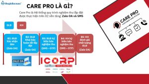
Care Pro là hệ thống quản lý và chuẩn hóa chất lượng lắp đặt với 3 yếu tố cốt lõi:
– Điểm lắp đặt phải ký xác nhận sau mỗi lần hoàn tất lắp máy – thể hiện rõ:
– Quy trình đã làm đúng hay chưa
– Hệ thống nước đạt các chỉ số yêu cầu
– Ảnh chụp & ghi nhận thực tế tại điểm lắp
– Khách được kiểm tra chỉ số nước ngay tại chỗ: pH, TDS, Hydrogen…
– Khách được xác nhận và ký nghiệm thu
– Khách có quyền đánh giá chất lượng điểm lắp đặt ngay trong hệ thống
– Bước checklists trước – trong – sau lắp đặt
– Nhắc nhở từng bước để tránh bỏ sót quy trình
– Đảm bảo mọi máy được bàn giao ở trạng thái chuẩn nhất
Care Pro mang lại lợi ích thiết thực cho cả đại lý, điểm lắp đặt và khách hàng. giúp nâng cấp toàn bộ hành trình trải nghiệm trong ngành lọc nước – từ lắp đặt, vận hành đến hậu mãi.
Chương trình tạo ra một quy chuẩn đồng bộ: kỹ thuật được kiểm soát tốt hơn, chất lượng lắp đặt minh bạch hơn và đại lý giảm tối đa lỗi phát sinh. Điểm lắp đặt có quy trình rõ ràng để làm việc chuyên nghiệp, được đánh giá minh bạch để nâng cao tay nghề.
Care Pro – chiến dịch nâng tầm chuẩn ngành lọc nước.


sageharborgoodsgallery.shop – Looks clean and minimal, easy to find information without confusion.
Users who prefer handcrafted ecommerce environments often explore sites such as Teal Vendor Cove Creative Atelier Hub where products are presented in a stylish and artistic layout – The interface creates a visually engaging browsing experience that feels structured, modern, and thoughtfully curated for easy exploration.
People who enjoy large category marketplaces often explore sites like Grove Timber Goods Emporium where items are arranged in a structured layout – The interface ensures browsing feels simple, smooth, and easy to follow across all sections.
Across prototype UI evaluations of marketplace systems, analysts found a strong teal harbor branding structure that feels unified, but the vendor hall section is incomplete when inspecting a href=”https://tealharborvendorhall.shop/
” />teal harbor marketplace vendor showcase link where the design appears polished and modern, yet the vendor hall is still populated with placeholder Lorem ipsum content which reduces engagement during testing cycles
During my search for useful online resources, I stumbled upon <a href="//woodharborvendorroom.shop/](https://woodharborvendorroom.shop/)” / click here to view which seemed like a helpful platform, and I might visit again sometime soon since it was easy to browse and understand.
Online platforms like this really nice platform deliver easy browsing and smooth user experience today Calm Cove digital storefront I found the overall experience very comfortable and easy to use
velvetgrovecraftboutique.shop – Little typo in description but overall I’m satisfied.
Across sandbox marketplace testing and frontend design reviews, developers observed embedded content sections containing meadow dune vendor access gateway placed in mid page structure, but the dual theme branding introduces visual contradiction – Meadow name contradicts dunes, making the interface feel disjointed and reducing the effectiveness of the overall design narrative in ecommerce usability studies conducted across multiple platforms
During a late evening browsing session focused on online marketplace designs, I discovered vendor parlor marketplace which offered a surprisingly clean interface with well spaced categories and smooth transitions between pages – The browsing flow feels natural, relaxed, and consistently well organized throughout the visit
Many online users browsing curated vendor platforms mention that navigation feels more intuitive when sections are clearly divided, especially when they encounter Meadow Room Entry Hub Forest Vendor Access Point and they often describe the interface as helpful for quick scanning of categories and reduced browsing effort – the layout is generally considered clean and supports smoother product exploration across multiple sections with less confusion overall in daily use
During a general exploration of curated online marketplace hubs and listing pages, I found something that seemed clean and efficient, particularly references including Cove jewel access portal – The interface looks pretty clean, and everything is arranged in a logical way, which makes navigation feel smooth and well organized.
Users who frequently browse online vendor sites often look for platforms that load quickly and keep interfaces simple Solar Meadow catalog entry this site delivers fast responses and makes searching content easy and efficient across all sections
While exploring niche retail and concept based online stores, I came across a rather unusual but intriguing platform presentation that stood out during browsing hope inspired market concept – The layout is simple yet effective, making the idea easy to understand while keeping navigation straightforward overall
While analyzing modern e-commerce storefront concepts and curated platforms, I discovered a section featuring Honey Meadow listing showcase embedded into a clean layout that prioritizes usability and flow – The browsing experience feels smooth, calm, and naturally intuitive across all pages
While browsing different online vendor platforms, I noticed how a clean interface combined with a simple layout makes exploring content much easier and more comfortable for users overall Silver Cove market hall hub everything feels organized and navigation is smooth across all sections
While browsing through multiple niche suggestions and curated online resources, I came across something that felt quite simple and clear, especially when seeing this easy navigation hub included – the information is presented in a direct format that helps quick understanding, so I might return later for a closer look.
During casual research into digital marketplace interfaces and vendor catalog systems for design inspiration and UX comparison across different references I came across Teal Harbor browsing dashboard entry – The experience feels streamlined and user friendly, with intuitive navigation and clearly separated content blocks that make exploration simple and efficient across all sections of the site
While scanning through online marketplace listings and vendor hubs, I noticed a site with a very appealing autumn theme, especially Autumn meadow commerce vendor hall portal – I really like the seasonal design, and hope they add real customer reviews soon.
When structure is clear, users can explore everything quickly, and this platform delivers that experience River Harbor listing portal navigation felt intuitive throughout
People who prefer simple digital commerce platforms often explore sites like Harbor Teal Organized Commerce Hub where items are displayed in a structured and accessible layout – The interface ensures a fast and easy browsing experience that feels clear, efficient, and user friendly throughout the store.
During my search for useful online sources, I stumbled upon click here now which contained interesting content, and I spent some time checking different sections today as I explored the site more carefully.
People who enjoy premium ecommerce structure often engage with sites like Cove Golden Vault Elite Hub where items are presented in a refined minimal format – The design ensures browsing feels polished, consistent, and visually balanced throughout the experience.
While analyzing prototype ecommerce systems with outdoor inspired UI structures, testers found a consistent timber trail theme that enhances visual storytelling, but navigation collapse occurs in key areas such as a href=”//timbertrailmarkethall.shop/](https://timbertrailmarkethall.shop/)” />timber trail marketplace vendor node where the design appears rustic and well crafted, yet the navigation system is non functional which disrupts user interaction during usability testing sessions
While analyzing experimental ecommerce interfaces and cart modules, developers encountered a navigation element featuring brook echo trade hall entry within checkout structure, but quantity updates do not apply correctly after user input – Echo brook branding is appealing, however the cart system does not synchronize changes across sessions or page reloads
за что отвечает l3 кеш в процессоре и как работает кеш памятьт процессора
While exploring a variety of niche online shopping experiments and vendor hub concepts, I came across online vendor parlor hub – The browsing flow was smooth and consistent, and I appreciated how the site encouraged discovery through simple category transitions and clean presentation overall browsing experience.
While going through different curated marketplace directories and resource pages, I came across something that felt clean and structured, especially where Mint orchard vendor hub appeared – I like the overall feel here, since it’s simple and easy going, allowing users to move through content without difficulty.
When exploring digital marketplaces, clean design and intuitive navigation often define a good user experience Icicle Brook goods portal this platform offers a pleasant browsing flow that helps users find what they need quickly and without hassle
While browsing premium winery brands and detailed product showcases, I came across a beautifully presented wine focused platform that stood out for its clarity and elegance canadian icewine brand page – The brand presentation is strong, with detailed wine information that feels both refined and visually appealing overall
During research into curated trade platforms and vendor showcase systems, I found Honey Meadow browsing station integrated into a clean and organized layout that improves content readability – The experience feels smooth, warm, and naturally easy to navigate through multiple sections
violetharborretaillane.shop – They responded to my email within an hour, nice.
During exploration of online vendor hub designs and trade gallery systems for UX evaluation and inspiration across sample platforms, I discovered Pebble Pine digital marketplace view placed in the content section – The platform was easy to navigate and I enjoyed browsing listings without confusion, with everything presented in a clear and structured manner.
A strong browsing experience depends on performance, and this site offers fast pages with well arranged content Silver Harbor browsing center I liked how responsive everything felt during navigation
As I browsed through various curated suggestion lists and online marketplace directories, I came across something that seemed easy to navigate and well arranged, particularly with this structured vendor access link included – the experience was enjoyable since everything feels neatly organized and accessible.
bayharbortradehouse – Almost identical to another bay domain, bit confusing tbh.
Users prefer platforms with smooth experience and structured layout because browsing becomes very convenient overall today Plum Harbor goods directory I appreciated how fast everything loaded
Users who prefer minimal ecommerce systems often explore sites such as Trail Commerce Harbor Market Hub where products are grouped in a clean and accessible format – The design ensures browsing feels smooth, user friendly, and well organized, helping users quickly locate what they need without unnecessary complexity.
While browsing digital marketplace concepts, I visited online parlor catalog and noticed how effectively it balances visuals with whitespace for better readability – The interface feels gentle, organized, and easy to process without visual strain
After reviewing several design-focused websites, I encounteredopen this visual page which impressed me since the design feels modern and neat, definitely stands out nicely and gives a clean and appealing browsing experience overall.
Users who enjoy minimal yet strong marketplace systems often explore sites such as Granite Orchard Vault Line Hub where products are arranged in a structured layout – The interface creates a browsing experience that feels stable, organized, and easy to navigate across the platform.
During a detailed page audit, it became apparent that follow this link – the footer includes social icons that give a false sense of interactivity, as they are not connected to any valid URLs.
While reviewing prototype ecommerce systems and support workflows, testers observed a contact panel containing harbor echo trade service hub integrated into UI structure, but outgoing customer service emails are not delivered and return bounce notifications – Echo harbor feels familiar and simple, however email backend reliability is broken and fails during all test attempts
Online shoppers tend to favor websites that maintain organized layouts and clearly defined sections for better usability Violet Harbor market hub this ensures a consistent browsing experience where navigation feels simple and structured throughout use
While going through different curated marketplace listings and resource hubs, I found something that seemed well organized and intuitive, especially when seeing Moon vendor cove portal included – Solid browsing experience overall, and I didn’t encounter anything confusing at all, which made everything feel smooth and easy to understand.
In the process of checking various online vendor pages, I noticed V “portal navigation snippet” appearing in a malformed structure, and Cicicleislemarketparlor.shop showed up centrally, while the design feels modern enough and navigation was quite simple to follow without any confusion.
Pingback: cialis 20mg mexico
During exploration of online trade gallery platforms and digital vendor hubs for inspiration I noticed Birch Harbor marketplace index page integrated into structured text – pages were responsive and well organized, giving a smooth browsing experience that felt efficient and easy to follow.
While researching digital creativity and experimental website layouts, I found a platform that strongly focuses on artistic structure and design innovation abstract design experiment page – The site feels creatively structured, offering an unusual but engaging layout that highlights experimental digital presentation styles
pineharbortradeparlor.shop – Nice interface design makes navigation simple fast and quite pleasant
A modern interface improves experience, and this platform ensures browsing feels very easy today and comfortable Linen Cove shop gateway I found navigation very natural and smooth