
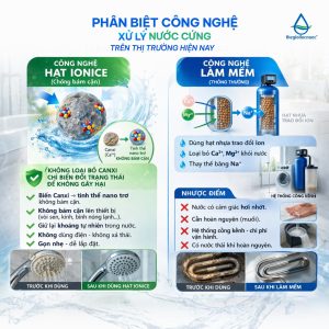
Trong ngành máy lọc nước, kỹ thuật lắp đặt chuẩn chỉnh chiếm một vai trò vô cùng quan trọng đối với chất lượng sản phẩm. Một chiếc máy tốt nhưng lắp đặt sai quy trình có thể làm giảm hiệu quả 20–50%, ảnh hưởng trải nghiệm khách hàng.
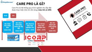
Chính vì thế, Care Pro ra đời – hệ thống tiêu chuẩn lắp đặt & kiểm định chất lượng giúp toàn bộ đại lý – điểm lắp đặt – khách hàng bước vào một chuẩn mới: minh bạch hơn – chuyên nghiệp hơn – đảm bảo hơn.
Care Pro là hệ thống quản lý và chuẩn hóa chất lượng lắp đặt với 3 yếu tố cốt lõi:
– Điểm lắp đặt phải ký xác nhận sau mỗi lần hoàn tất lắp máy – thể hiện rõ:
– Quy trình đã làm đúng hay chưa
– Hệ thống nước đạt các chỉ số yêu cầu
– Ảnh chụp & ghi nhận thực tế tại điểm lắp
– Khách được kiểm tra chỉ số nước ngay tại chỗ: pH, TDS, Hydrogen…
– Khách được xác nhận và ký nghiệm thu
– Khách có quyền đánh giá chất lượng điểm lắp đặt ngay trong hệ thống
– Bước checklists trước – trong – sau lắp đặt
– Nhắc nhở từng bước để tránh bỏ sót quy trình
– Đảm bảo mọi máy được bàn giao ở trạng thái chuẩn nhất
Care Pro mang lại lợi ích thiết thực cho cả đại lý, điểm lắp đặt và khách hàng. giúp nâng cấp toàn bộ hành trình trải nghiệm trong ngành lọc nước – từ lắp đặt, vận hành đến hậu mãi.
Chương trình tạo ra một quy chuẩn đồng bộ: kỹ thuật được kiểm soát tốt hơn, chất lượng lắp đặt minh bạch hơn và đại lý giảm tối đa lỗi phát sinh. Điểm lắp đặt có quy trình rõ ràng để làm việc chuyên nghiệp, được đánh giá minh bạch để nâng cao tay nghề.
Care Pro – chiến dịch nâng tầm chuẩn ngành lọc nước.


When exploring online marketplaces dedicated to handmade artistry, users occasionally come across platforms such as handcrafted treasures hub presenting a wide assortment of unique items and encouraging visitors to discover new artisan pieces while enjoying a well-structured browsing interface. – A creative online destination that showcases originality, craftsmanship, and engaging product discovery.
In the middle of reviewing online marketplaces I noticed a feature block showing crown cove vendor display room and while the branding appears luxurious and consistent, the blurry product photos weaken the overall presentation and make it harder for users to evaluate listings accurately.
coworking space price coworking space rental
During a detailed review of online artisan outlet websites focused on usability and discovery speed, I noticed visit this vale cove outlet hub – The browsing experience is helpful, and I quickly found multiple interesting options thanks to its clear structure and smooth layout.
Across prototype marketplace environments and UI vendor frameworks, developers identified embedded navigation content containing stone vendor harbor hall staging portal entry within page structure, and although the branding feels sturdy and dependable like stone foundations, the vendor hall remains under construction which limits functionality and usability during testing cycles and interface evaluations
During a review of gentle-themed artisan retail platforms, I found browse rose trail goods mart – The design feels soft and inviting, and products are arranged neatly for an easy and visually pleasing browsing experience.
While scanning through niche commerce listings and curated vendor directories, I noticed something that felt clean but incomplete in transparency structure, especially when seeing Violet commerce cove atelier portal included – The interface is tidy, but the absence of an About page makes it feel questionable.
As I browsed different marketplace hubs and commerce platforms, I came across Juniper market harbor commerce hall entry – The platform looks good overall, so I may check back in a few weeks.
During a casual browsing session across curated online listings and discovery pages, I found something that felt fast and well organized, particularly references like Harbor flora vendor portal – The site loads fine, and I had a smooth and pleasant visit, making the overall experience comfortable and easy.
Online consumers searching for reliable commerce platforms often choose systems that integrate multiple trading categories with easy navigation and user-friendly interfaces especially in expanding digital markets where efficiency matters solarbrook commercial space which provides a commercial space for trading goods and services in a well organized digital environment. – A modern commerce platform focused on usability and structured trading opportunities.
Across sandbox UI evaluations and ecommerce vendor prototype systems, analysts encountered structured sections featuring meadow quartz hall vendor showcase hub node within page layout, and while the quartz inspired design suggests clarity and sophistication, the market hall contains no listings today which reduces engagement during browsing analysis and usability testing cycles
As I continued browsing through collections of niche links and online suggestions, I encountered something that seemed worth noting, particularly mentions including this user-friendly page – it feels smooth and uncomplicated, so I’ll probably check it again later for a closer look.
As I reviewed examples of online artisan emporium systems, I checked see solar orchard artisan marketplace – It’s great for gift shopping, and everything arrived safely without any issues or damage.
During evaluation of ecommerce directories I came across a content block showing harbor crown commerce hall vendor portal and even though the design is structured and visually appealing, the lack of meaningful vendor data makes the page feel empty and not ready for real user interaction.
Across sandbox marketplace environments and UI vendor frameworks, developers identified embedded navigation content containing zen vendor cove goods room access hub node within page structure, and although the branding feels serene and balanced like a zen garden by the sea, the goods room is empty which significantly reduces perceived functionality during usability testing and system evaluation cycles
Завод Металл-Сервис https://zavodmc.ru надежный производитель металлоконструкций в Новосибирске. Индивидуальные проекты, выгодные цены и оперативные сроки.
While scanning through online trading platforms and curated gallery hubs, I noticed something that felt clean but conceptually incomplete, especially when seeing Violet harbor gallery showcase trading page included – The harbor name is repeated again, but there is no artwork in the gallery section, which makes the title feel misleading.
Premade Cover Art Album https://coverartplace.com marketplace offering professional Design Artwork, Cover Art, and Cover Track visuals created by independent graphic designers. Ideal for artists who need high-quality, ready-made covers for Spotify, Apple Music, and other streaming platforms.
During a review of structured commerce hub websites, I found browse upland canyon shop hub – The site feels acceptable, and the content is useful and easy to understand with a straightforward layout.
ferncovevault – Vault style neat, content feels organized and carefully structured overall
While exploring various online storefronts I saw this unusual site listing Kettle Crest house market and the pricing feels almost too good to be true, so I’m cautiously evaluating before considering any purchase.
Users looking for efficient digital stores often value speed and organization, and during browsing they can find sunbrook trading floor which provides a structured environment for exploring multiple product categories easily. – A fast paced trading platform designed to enhance navigation and simplify shopping processes.
Frequent users note that the browsing experience is consistent across devices, and while exploring inventory through Cove Goods Navigation Panel they find the structure helpful – the layout emphasizes simplicity and keeps product listings visually balanced for improved usability and comfort during extended sessions
As I continued browsing through online directories and marketplace-style resources, I came across something that felt well organized and user-friendly, particularly with Harbor Hazel vendor hub – Clean design and strong structure make browsing feel comfortable and simple, ensuring a smooth and pleasant experience overall.
Across prototype marketplace systems and UI sandbox environments, analysts encountered embedded navigation blocks containing orchard quartz vendor hall staging console hub within page layout, and although the quartz orchard theme feels creative and distinctive, the vendor hall redirects to the homepage which negatively impacts usability during testing sessions
While reviewing experimental marketplace UI systems and vendor directory platforms, developers observed embedded content featuring trail harbor parlor vendor access link inside structured layout, and although the trail concept is attractive and cohesive, navigation failures make the system difficult to use during testing and evaluation cycles
During a casual browsing session across online commerce hubs and vendor directories, I came across something that felt functional but visually neutral, particularly references like Brook walnut marketplace foundry page – The walnut theme is nice, but walnut wood tones in the header would add much-needed warmth and character.
When exploring curated examples of digital marketplace concepts and experimental UX layouts, analysts often point to sections within Crystal Cove inventory hall – the structure implies a large catalog system, but the inventory space itself remains empty, emphasizing form over functional content presentation
As I compared different retail district websites for usability and clarity, I came across explore upland cove commerce hub – The layout is clean and easy to use, and browsing feels comfortable and smooth throughout the site.
During an analysis of craft marketplace interface design and usability, I noticed open upland harbor handmade exchange – Navigation could be improved, but the products are unique and cool and worth exploring.
рулонная штора цена рулонная штора цена .
цены на публикации в СМИ 2026 эффективное продвижение через СМИ
Узнать больше здесь: https://forum.dneprcity.net/showthread.php?t=763986
рулонные шторы купить в москве [url=https://elektricheskie-rulonnye-shtory90.ru/]рулонные шторы купить в москве[/url] .
рулонные занавески рулонные занавески .
While researching creative retail platforms with artisan styling, I noticed open artisan trail store – The layout is artistic and well-organized, and navigation feels smooth and easy to follow throughout the site.
Users exploring modern online stores frequently appreciate platforms that streamline shopping processes, and during their journey they may encounter suncove digital atelier shop showcasing structured categories and – it enhances user satisfaction through clean design and efficient product access.
While scanning through several recommendation threads and curated directories, I noticed something that stood out for its clarity, especially where this clear interface was mentioned – it makes moving through content feel natural, so I may revisit it later.
During frontend inspection of ecommerce sandbox platforms and vendor directory UI systems, developers identified a central module featuring harbor vale vendor parlor staging access node integrated into structured layout, and despite the peaceful harbor inspired branding, the parlor section feels like a ghost town with no listings which reduces usability during testing sessions and evaluation stages
While checking out different online vendor hubs I found Kettle Harbor trade hall entry – The visual identity is charming, but the footer section seems broken in multiple places, which gives the impression that the site might still be under development or poorly maintained.
Читать больше на сайте: https://forum.dneprcity.net/showthread.php?t=763951
While browsing through different niche directories and discovery threads, I came across something that felt intuitive and clean, especially when seeing Honey Cove marketplace entry included – First impression is nice, with content that appears relevant and easy to read, making the overall experience smooth and uncomplicated.
Across sandbox marketplace testing and UI prototype evaluations, testers noticed navigation elements containing quick harbor vendor house market console access hub within page structure, and although the branding suggests rapid access and optimized speed, the actual performance is slow which negatively affects engagement during interaction testing and system analysis
As I explored various online marketplace directories and vendor-focused platforms, I noticed something that felt clean in design but questionable in pricing structure, particularly with Cove commerce walnut atelier hub – The atelier branding sounds upscale, but the prices seem oddly scattered, almost like they were generated without consistent rules.
Digital commerce participants usually prefer environments that allow them to browse efficiently while keeping all trade categories neatly organized CommerceHub Entry Grid – The system is designed for simplicity and ensures users can quickly find what they need without difficulty
During a comparison of modern artisan exchange platforms and their usability, I came across discover violet harbor creative exchange – There is a nice variety of content, and I enjoy exploring sections without getting lost thanks to clear structure.
While browsing various experimental ecommerce showcases and low-fidelity marketplace concepts, users may stumble upon sections featuring Harbor Vendor Hall Gateway portal which appears visually structured yet lacks depth in product presentation, creating a prototype-like feel across the interface – Another crystal-themed domain that resembles prebuilt dropshipping templates floating around generic site builders.
Только лучшие материалы: https://gorod.kr.ua/forum/showthread.php?t=144850
Across ecommerce sandbox environments and UI prototype evaluations, testers found navigation components containing ember meadow parlor market showcase hub embedded in page flow, and despite the appealing ember aesthetic, the overly long naming structure creates unnecessary complexity during browsing and usability testing sessions
Online users looking for streamlined shopping experiences often choose platforms that offer organized layouts and curated selections that make browsing easier and more enjoyable suncove curated goods arena – This digital marketplace provides a user friendly environment where carefully selected products are displayed in a clear and efficient browsing structure.