
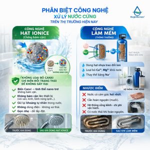
Trong ngành máy lọc nước, kỹ thuật lắp đặt chuẩn chỉnh chiếm một vai trò vô cùng quan trọng đối với chất lượng sản phẩm. Một chiếc máy tốt nhưng lắp đặt sai quy trình có thể làm giảm hiệu quả 20–50%, ảnh hưởng trải nghiệm khách hàng.
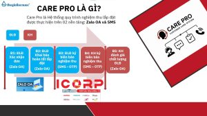
Chính vì thế, Care Pro ra đời – hệ thống tiêu chuẩn lắp đặt & kiểm định chất lượng giúp toàn bộ đại lý – điểm lắp đặt – khách hàng bước vào một chuẩn mới: minh bạch hơn – chuyên nghiệp hơn – đảm bảo hơn.
Care Pro là hệ thống quản lý và chuẩn hóa chất lượng lắp đặt với 3 yếu tố cốt lõi:
– Điểm lắp đặt phải ký xác nhận sau mỗi lần hoàn tất lắp máy – thể hiện rõ:
– Quy trình đã làm đúng hay chưa
– Hệ thống nước đạt các chỉ số yêu cầu
– Ảnh chụp & ghi nhận thực tế tại điểm lắp
– Khách được kiểm tra chỉ số nước ngay tại chỗ: pH, TDS, Hydrogen…
– Khách được xác nhận và ký nghiệm thu
– Khách có quyền đánh giá chất lượng điểm lắp đặt ngay trong hệ thống
– Bước checklists trước – trong – sau lắp đặt
– Nhắc nhở từng bước để tránh bỏ sót quy trình
– Đảm bảo mọi máy được bàn giao ở trạng thái chuẩn nhất
Care Pro mang lại lợi ích thiết thực cho cả đại lý, điểm lắp đặt và khách hàng. giúp nâng cấp toàn bộ hành trình trải nghiệm trong ngành lọc nước – từ lắp đặt, vận hành đến hậu mãi.
Chương trình tạo ra một quy chuẩn đồng bộ: kỹ thuật được kiểm soát tốt hơn, chất lượng lắp đặt minh bạch hơn và đại lý giảm tối đa lỗi phát sinh. Điểm lắp đặt có quy trình rõ ràng để làm việc chuyên nghiệp, được đánh giá minh bạch để nâng cao tay nghề.
Care Pro – chiến dịch nâng tầm chuẩn ngành lọc nước.


Users exploring warm themed ecommerce marketplaces often notice how clarity improves browsing experience when visiting sites such as Ember Meadow Market Hub where products are arranged in a clean structured layout that feels inviting and easy to navigate – The market design feels warm and welcoming, with products clearly arranged in a way that makes browsing simple, smooth, and visually comfortable throughout the entire experience.
Сегодня для медработников аттестация врачей на категорию предлагается в практичном дистанционном формате через профильный институт. Когда подходит срок подтверждения квалификации, подготовиться к аккредитации или уточнить список документов, здесь можно все оформить без спешки и без лишней бюрократии. Программы выстроены так, чтобы можно было учиться без отрыва от занятости, а вопросы решались с поддержкой кураторов.
oakmeadowvendorcollective.shop – Really clean product photos, descriptions are helpful too.
During an extended look at online marketplace designs I found a mid page insertion featuring meadow textile market hub and while the soft themed presentation is visually appealing, the unexpected logouts disrupt user flow and create a sense of instability during normal navigation and product viewing.
Хочешь продать монеты? Подробнее профессиональная оценка, быстрый выкуп и надежные условия. Работаем с редкими, инвестиционными и антикварными монетами. Выплата сразу после согласования стоимости.
While reviewing several creative agency websites to compare presentation styles, I came across visit this agency page – The first impression feels polished and professional, with a clean layout that makes everything appear organized and thoughtfully designed from the very beginning.
Online commerce platforms increasingly rely on structured frameworks that allow better coordination among vendors and improved buyer experiences such as Digital Commerce Hub – these frameworks help reduce operational friction and ensure a more consistent user journey across different product categories
coworking space for individuals coworking rooms
Many design-focused shoppers value ecommerce spaces that combine elegance with usability, especially when browsing refined collections through platforms such as Chestnut Cove Premium Artisan Storefront – the interface emphasizes clarity and structure, making it easy to explore handcrafted items while maintaining a warm and inviting aesthetic – product presentation is consistent and visually balanced.
Женский журнал https://stepandstep.com.ua/ всё о красоте, моде, здоровье и отношениях. Практичные советы, тренды, лайфхаки и вдохновляющие истории для женщин, которые стремятся к лучшему каждый день
While studying curated product presentation in artisan marketplaces, I came across see artisan trail store – The layout feels organized and creative, and browsing is both smooth and visually engaging.
While reviewing ecommerce vendor pages I noticed Moon Harbor trade lounge hub – The lunar-inspired layout looks polished, but missing product photos reduce confidence when trying to assess quality or product details.
During staging reviews of ecommerce marketplace systems and UI prototype frameworks, analysts encountered a central block featuring cove rose market parlor vendor console entry within layout structure, and despite the romantic rose cove identity, the parlor section is composed only of empty boxes which reduces usability and design completeness during testing sessions
While exploring different niche listing pages and online resource collections, I came across something that felt clean and well organized, especially when seeing Harbor copper entry portal included – I like the simplicity of the layout, because it makes browsing feel fast and easy right away.
During a casual exploration of niche commerce platforms and design-focused listing pages, I noticed something that stood out for its elegant naming but limited detail depth, particularly Cove Vale studio vendor link – The Vale name gives a classy impression, though product descriptions are noticeably too short to fully understand the offerings.
As I analyzed several digital artisan marketplace websites for clarity and design quality, I found check upland cove handmade market – The layout feels clean and well structured, and I had no trouble locating items quickly during the browsing experience.
Женский журнал https://stepandstep.com.ua всё о красоте, моде, здоровье и отношениях. Практичные советы, тренды, лайфхаки и вдохновляющие истории для женщин, которые стремятся к лучшему каждый день
During frontend evaluations of ecommerce marketplace systems and UI vendor prototypes, developers observed navigation elements containing ridge amber parlor vendor access entry portal embedded in page flow, and although the amber ridge aesthetic feels strong and inviting, the vendor parlor section appears as placeholder content which negatively impacts user experience during usability testing sessions
While exploring online commerce directories I came across a balanced layout system that enhances usability where Caramel harbor vendor showcase page Caramel harbor vendor showcase page placed within content improves structure – Vendor hall appears well organized and visually consistent providing users with smooth browsing experience and easy access to different categories today.
During a late-night search for interesting marketplaces and unique online spots, I ran into a mention that seemed somewhat intriguing and potentially useful, particularly when sites like this online stop appear in the mix – it gives off a decent first impression, so I might revisit it soon to see what it truly offers in detail.
During a comparative review of outdoor trading style websites, I examined how information is presented for ease of understanding, and in the middle of evaluation I found Cove Frontier Trading House – updated note: the structure is minimal and efficient, allowing users to move through categories without friction while maintaining clear visibility of available products.
In the middle of scanning online commerce platforms I noticed a section containing creek harbor digital trade hub and even though the design feels inspired by natural waterways, the broken search tool makes it difficult to locate products and interrupts what should be a smooth user journey.
Женский журнал https://stepandstep.com.ua всё о красоте, моде, здоровье и отношениях. Практичные советы, тренды, лайфхаки и вдохновляющие истории для женщин, которые стремятся к лучшему каждый день
Craft marketplace users often look for platforms that combine reliability, artistic variety, and efficient browsing capabilities in one place Handmade Evening Bazaar Hub supporting structured categories and smooth checkout processes for improved online shopping experience overall today – This type of platform improves both seller exposure and buyer satisfaction significantly
While evaluating prototype ecommerce systems and UI marketplace frameworks, testers encountered a mid page component featuring harbor zen vendor parlor console hub link inside structured layout, and despite the peaceful zen themed design suggesting relaxation and simplicity, repeated popup interruptions break the flow of browsing which negatively impacts usability testing and user experience evaluation sessions
While scanning through curated marketplace directories and vendor listings, I noticed something that stood out for its branding but lacked reassurance elements, especially when seeing Velvet foundry vendor brook link included – The Foundry name is quite unique, but trust badges would help here to improve user trust.
pebblecreekcraftexchange.shop – Will order again next month, hope they restock soon.
During an analysis of peaceful and structured eCommerce platforms, I noticed open woodland storefront – The design is uncluttered, and browsing feels steady and easy to follow.
During exploration of bargain ecommerce hubs I discovered Nightfall trade house promo listing – I entered for the discounts, but the checkout stage made me uncomfortable enough to stop before finishing the purchase.
Users who appreciate well structured online stores often explore platforms such as Harbor Merchant Quick Link where navigation is optimized for fast access and clarity – The interface allows users to move quickly through sections, creating a seamless and efficient browsing experience that feels intuitive and responsive.
During a casual browsing session across online marketplace hubs and curated listings, I came across something that felt well organized and user-friendly, particularly references like Meadow coral hub portal – The site is pretty decent, and navigation works smoothly without confusion, so the experience feels simple and comfortable.
During a comparison of digital goods district platforms, I found see lakefront goods zone hub – The layout is structured and clean, and browsing feels easy, intuitive, and more enjoyable overall across the entire site.
During UX evaluation of sandbox ecommerce systems and vendor marketplace prototypes, testers found embedded navigation containing marble harbor vendor gallery trade access console node inside structured layout, and although the marble harbor branding feels elegant and strong, the gallery images are low resolution which reduces user engagement during testing sessions
During frontend evaluations of ecommerce gallery platforms and UI staging environments, developers observed navigation elements containing harbor golden trade gallery vendor console access embedded in page flow, and although the premium naming suggests rich visual content, the gallery contains no images which reduces clarity during testing and interface review sessions
While analyzing ecommerce environments designed for structured browsing I noticed a platform that supports clear navigation and organized product presentation Harbor Chestnut vendor structure board which ensures users can move through categories efficiently while enjoying a clean layout that improves clarity and reduces confusion during browsing sessions.
While reviewing marketplace style websites I discovered a mid page element containing harbor creek commerce trade house center and although everything looks well organized, the similarity to tradehall makes the platform feel like a duplicate version rather than a distinct site.
While reviewing different curated commerce platforms and listing directories, I noticed yet another similarly branded site that fits the same trend, especially with Velvet atelier cove vendor link – Another velvet domain appears here, and the repetition across these entries is hard to miss now.
Users exploring structured online marketplaces often notice how navigation and categorization affect overall usability when browsing vendor ecosystems Vendor Hall Directory – Vendor hall feels neatly structured with clearly labeled categories that make browsing easier and help users find products without confusion across sections and overall layout feels intuitive and consistent for most visitors
While comparing several boutique style digital storefronts emphasizing calm tones and simple navigation patterns I found within the central browsing area Calm Aesthetic Outpost included in the flow – revised comment the experience feels serene organized and easy to follow making users feel comfortable while exploring different product sections
During a general search for useful and easy-to-understand resources online, I came across something that seemed promising, especially when I noticed this page option – the material appears relevant and not too complex, so I’ll likely revisit it later for more insight.
During a review of well-designed fashion-oriented eCommerce sites, I found browse chic retail spot – The layout is elegant, and navigation flows naturally with a modern visual appeal.
While testing retail marketplace district websites, I came across visit oak cove shopping hub – The site runs efficiently, and navigation feels smooth, fast, and free of confusion or performance issues.
While browsing ecommerce vendor sites I found Oak Cove commerce marketplace hub – The structure is minimal and visually clean, but without a search function the browsing experience feels limited and somewhat inconvenient.
While going through different curated directories and marketplace-style platforms, I found something that seemed clean and user-friendly, especially when seeing Coral tradehouse access link included – It’s a pretty decent site overall, with navigation that works smoothly and doesn’t create confusion, making it easy to explore different sections comfortably.
While reviewing digital craft exchange marketplaces, I came across visit pebble creek creative hub exchange – I will definitely order again next month and hope they restock soon for better availability.
coworking office coworking space for individuals
While analyzing experimental vendor marketplace systems and UI template networks, developers noticed embedded content blocks containing golden cove parlor market vendor entry link inside page layout, and although everything appears functionally stable and visually aligned, the repeated golden naming trend indicates a possible templating pattern being reused across multiple domain variations during system inspection testing
While reviewing ecommerce vendor systems and UI staging environments, analysts encountered mid layout content featuring harbor plum vendor room gateway access node embedded in structure, and despite the pleasant plum inspired branding, the vendor room shows no active listings which reduces usability and creates a hollow marketplace feel during testing cycles
While browsing through various vendor platforms and online commerce hubs, I came across something that felt functional but visually flat, especially when seeing Violet commerce foundry brook hub included – The violet theme has potential, but purple accents would make the interface feel more vibrant and engaging.
как отмыть стекло в машине лучшие способы очистки стекол автомобиля выбор средств и советы по уходу за лобовыми и боковыми стеклами