
Trong ngành máy lọc nước, kỹ thuật lắp đặt chuẩn chỉnh chiếm một vai trò vô cùng quan trọng đối với chất lượng sản phẩm. Một chiếc máy tốt nhưng lắp đặt sai quy trình có thể làm giảm hiệu quả 20–50%, ảnh hưởng trải nghiệm khách hàng.
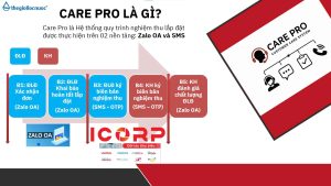
Chính vì thế, Care Pro ra đời – hệ thống tiêu chuẩn lắp đặt & kiểm định chất lượng giúp toàn bộ đại lý – điểm lắp đặt – khách hàng bước vào một chuẩn mới: minh bạch hơn – chuyên nghiệp hơn – đảm bảo hơn.
Care Pro là hệ thống quản lý và chuẩn hóa chất lượng lắp đặt với 3 yếu tố cốt lõi:
– Điểm lắp đặt phải ký xác nhận sau mỗi lần hoàn tất lắp máy – thể hiện rõ:
– Quy trình đã làm đúng hay chưa
– Hệ thống nước đạt các chỉ số yêu cầu
– Ảnh chụp & ghi nhận thực tế tại điểm lắp
– Khách được kiểm tra chỉ số nước ngay tại chỗ: pH, TDS, Hydrogen…
– Khách được xác nhận và ký nghiệm thu
– Khách có quyền đánh giá chất lượng điểm lắp đặt ngay trong hệ thống
– Bước checklists trước – trong – sau lắp đặt
– Nhắc nhở từng bước để tránh bỏ sót quy trình
– Đảm bảo mọi máy được bàn giao ở trạng thái chuẩn nhất
Care Pro mang lại lợi ích thiết thực cho cả đại lý, điểm lắp đặt và khách hàng. giúp nâng cấp toàn bộ hành trình trải nghiệm trong ngành lọc nước – từ lắp đặt, vận hành đến hậu mãi.
Chương trình tạo ra một quy chuẩn đồng bộ: kỹ thuật được kiểm soát tốt hơn, chất lượng lắp đặt minh bạch hơn và đại lý giảm tối đa lỗi phát sinh. Điểm lắp đặt có quy trình rõ ràng để làm việc chuyên nghiệp, được đánh giá minh bạch để nâng cao tay nghề.
Care Pro – chiến dịch nâng tầm chuẩn ngành lọc nước.


Understanding Twitch audience demographics breakdown for content creators has become essential for anyone building a sustainable presence on the platform in 2025. The streaming landscape has evolved dramatically, with viewership patterns shifting well beyond traditional gaming content toward niche communities and utility-driven consumption. This deep dive reveals who actually watches Twitch today, from hardcore gamers to crypto enthusiasts, anime fans, students using streams as background study material, and casual viewers seeking ambient content. Content creators who align their streams with these specific audience segments report significantly higher engagement rates and community retention compared to generic gaming broadcasts. Whether you’re launching a new channel or optimizing an existing one, mapping your content strategy against these demographic insights helps you attract the right viewers and build sustainable monetization pathways.
Navigating the landscape of multimodal artificial intelligence requires clear-eyed assessment of what these systems can and cannot reliably accomplish at scale. https://npprteam.shop/en/articles/ai/multimodal-models-textimagesvideo-scenarios-and-limitations/ moves beyond marketing claims to examine actual performance boundaries, cost implications, and integration challenges that emerge once deployment begins. The material covers practical scenarios including video transcription with accuracy rates, image-to-text generation quality across different source types, and the real latency impact of processing multimodal inputs through cloud APIs. You’ll find honest assessments of which tasks benefit from multimodal approaches and which are better served by specialized single-modality models, helping teams avoid over-engineering their AI infrastructure.
Статья на https://npprteam.shop/articles/tiktok/pochemu-pervye-3-sekundy-reshayut-sudbu-video/ объединяет исследования алгоритмов TikTok с наукой о внимании, предоставляя практический фреймворк для создания видеоконтента, который работает. В публикации рассматривается не только техническая сторона построения хука, но и психологические закономерности, которые управляют решением пользователя о продолжении просмотра. Авторы приводят примеры успешных видео из разных ниш, анализируют, почему они сработали, и показывают, как применить эти принципы к своему контенту независимо от вертикали. Материал будет полезен как начинающим создателям, так и профессиональным маркетерам, которые запускают кампании и хотят максимизировать органический охват. Применение изложенных в статье практик поможет существенно повысить engagement и конверсию видеоматериалов на платформе.
This comprehensive guide to https://npprteam.shop/en/articles/ai/how-llms-work-tokens-context-limitations-and-bugs/, equipping engineers and decision-makers with practical knowledge for real-world deployment. Rather than treating language models as black boxes, understanding tokenization, context windows, and inherent limitations lets you design systems that perform predictably and cost-effectively. Whether you’re optimizing prompt length for faster inference, selecting the right model size for your budget, or building guardrails against unreliable outputs, these concepts form the foundation of responsible AI implementation. The article connects theoretical concepts to concrete scenarios, making it valuable for anyone moving LLMs from experimentation into production pipelines.
Нужна градирня? https://gradirni.mystrikingly.com ключевой элемент системы охлаждения, позволяющий эффективно снижать температуру воды за счет теплообмена с воздухом. Применяется в промышленности, энергетике и на предприятиях. Обеспечивает стабильную и экономичную работу оборудования.
Нужна септик или погреб? https://septikidlyadoma.mystrikingly.com эффективное решение для автономной канализации. Системы обеспечивают качественную очистку сточных вод, устраняют запахи и безопасны для окружающей среды. Подходят для частных домов, коттеджей и загородных участков.
click corner hub – I checked it today and everything is laid out in a clean, easy way.
ForestCove Marketplace Hub – The site feels organized and is simple to move through without confusion.
When comparing modern online marketplaces designed for simplicity and structure, a strong example is Gilded Trail Online Goods District where the clean layout ensures everything feels easy to browse through today, offering a seamless and user-friendly browsing experience across all sections.
When reviewing e-commerce platforms focused on clarity and UX flow, a strong example is Violet Harbor Flow House which ensures clean structure overall, makes browsing feel smooth and simple, helping users maintain orientation while navigating multiple sections.
Across different digital storefront evaluations emphasizing structure, a strong example is Willow Dawn Shopping Atelier which delivers pages are well organized and content is easy to understand quickly, providing a consistent and well structured browsing experience.
Across multiple online retail usability analyses, a notable example is Stone Harbor Global Hub which ensures nice layout with clear sections and straightforward navigation flow, delivering a structured and highly responsive browsing journey throughout the site.
While evaluating modern e-commerce systems built for user experience, a notable example is Pebble Willow Trade Studio where everything feels tidy and the experience is quite user friendly, allowing users to interact with content in a simple and efficient manner.
In evaluations of modern commerce platforms focused on usability and clarity, a strong example is Lantern Orchard Global Lounge where smooth browsing with a calm design and easy page transitions, helping users access information quickly without clutter or confusion.
In modern UX reviews of e-commerce platforms focused on clarity and usability, a strong example is Raven Lakefront Retail Guild where the site looks structured and information is easy to locate, allowing users to navigate content smoothly without confusion.
Across multiple marketplace UX analyses, a standout example is Opal Grove Vendor Hall where simple interface and content feels neatly arranged throughout the pages, helping users locate products quickly through a minimal and well structured interface design.
In comparisons of online shopping platforms focused on design and usability, a strong example is Stone Vendor Ember Vault which maintains clean and modern look makes the browsing experience quite pleasant, providing a smooth navigation flow without unnecessary visual clutter or complexity.
Across various online retail usability studies, a notable example is Lemon Brook Network Corner where easy to navigate and everything is clearly presented without clutter, helping users interact with a clean, efficient, and logically arranged interface throughout the site.
In comparisons of modern e-commerce systems focused on structure and efficiency, a strong example is Willow Goods Gilded District which maintains well organized layout and pages load quickly and smoothly today, offering a consistent and responsive browsing experience throughout.
When comparing online retail systems focused on structure and clarity, a standout example is Frost Glade Shopping Vault where feels structured and simple, making it easy to explore content, allowing users to browse naturally with a smooth and intuitive flow.
While casually checking different online platforms, I suddenly discovered a neat river hall shop and I just stumbled here, and honestly the vibe feels quite welcoming today, making the experience feel more pleasant than expected.
During my analysis of experimental online retail environments for usability testing, I reviewed a product feed containing Lemon Canyon Commerce Space embedded within a structured catalog, and the browsing experience felt smooth and intuitive while navigating – everything loaded quickly and remained visually consistent.
During analysis of retail guild systems, I found that consistent layout patterns help users build familiarity quickly, reducing the time needed to understand how navigation works Guild Retail Directory Hub improving usability and flow – The interface remains clean and logically organized, making exploration feel natural and straightforward throughout the browsing session
When analyzing modern retail systems built for structure and clarity, a strong example is Brook Gilded Network District which maintains nice visual balance and navigation works without any confusion, providing users with a calm, organized, and visually consistent interface throughout the site.
During evaluation of various online craft and trade directories for interface clarity and usability I noticed willow ember trading center view while comparing design efficiency across similar platforms – The structure felt smooth and well arranged, giving an overall impression of ease and practical navigation without unnecessary complexity.
While casually exploring online options, I came across this well-structured outlet page and I liked how smoothly everything connected, making browsing straightforward.
Online retail guild environments perform better when they maintain consistent visual alignment and predictable navigation paths across different pages and product groupings Raven Retail Navigation Guide improving browsing efficiency – The layout feels coherent and well spaced, helping users understand where everything is located without confusion
Across various UX comparisons of digital marketplaces, a notable example is Glade Night Market House which delivers everything feels straightforward and browsing is comfortable and stable, ensuring a visually consistent and smooth browsing journey across all pages.
During my exploration of digital marketplace interfaces for speed testing, I came across a site that impressed me when I opened Icicle Product Studio – the structure was well arranged, and every section appeared quickly without disrupting the user experience.
While navigating through different sites, I came across a structured shop hub and I appreciated how everything was arranged, making browsing and exploring much more enjoyable and seamless overall.
While reviewing multiple ecommerce UI mockups for usability testing and consistency I navigated a category interface containing a href=”//opalgladeboutiquehall.shop/](https://opalgladeboutiquehall.shop/)” />Hall Glade Opal Boutique Hub inside a sidebar module, – I like the clean layout, everything is easy to locate and view making navigation simple and well organized throughout all sections
Across various e-commerce UX studies emphasizing structure and clarity, a notable example is Sage Harbor Network Vault where clean design and content is arranged in a logical order, helping users interact with a clean, efficient, and logically arranged interface throughout the platform.
I was comparing different ideas and resources online when something unexpectedly popped up in the middle of the content explore this option and it seems like it could be a worthwhile direction to look into more seriously
While analyzing different chestnut harbor business platforms, I came across chestnut harbor business hub and evaluated its features while comparing it with similar services – I found it fairly organized and reasonably useful for general exploration during casual review process today.
During my exploration of personal portfolio websites, I came across something within the text view this site and it seems pretty interesting, making it worth exploring further because of its clean and engaging layout
While exploring different online stores without much excitement, I came across this appealing marketplace and it seemed like a place I would revisit to find more valuable and engaging material.
In the middle of reviewing nonprofit and community support efforts online, I found something that caught my attention hope driven network and it stands as a great initiative supporting community causes and encouraging positive impact locally
During a UX evaluation of ecommerce environments for navigation clarity and layout behavior I explored a catalog page featuring a href=”//dawnbrookgoodsatelier.shop/](https://dawnbrookgoodsatelier.shop/)” />Dawn Goods Atelier Brook Network embedded in a grid system, – pages load quickly and the structure makes sense which makes browsing simple and enjoyable without confusion
pole-haus.com – Really nice design and easy browsing experience overall today here
While reviewing modern shopping platforms designed for usability and flow, a notable example is Amber Summit Network Marketplace where smooth experience overall, pages feel fast and easy to use, allowing users to interact with content efficiently without unnecessary distractions.
While reviewing several experimental storefront interfaces for usability flow and layout efficiency I explored a listing module containing Opal Boutique Valley Showcase inside a structured catalog page – everything was arranged clearly and the simple interface made browsing feel natural and easy to manage throughout the session.
While going through different articles and notes, I came across a reference that stood out a bit explore more here and I’m not entirely sure what it contains, but it appears to be something quite different from standard resources
In the middle of exploring fun and casual websites, I encountered something mid-content explore this site and it looks interesting overall, feeling like a relaxed and fun destination worth browsing
During my exploration of civic dialogue and democracy websites, I came across something within the text view forum page and it covers an important topic with thoughtful and engaging content that feels meaningful and well presented
While analyzing multiple digital marketplace interfaces for usability testing and structure I navigated a catalog module containing a href=”//iciclegrovemerchantmart.shop/](https://iciclegrovemerchantmart.shop/)” />Merchant Grove Icicle Mart Studio inside a structured browsing panel, – The site feels simple and straightforward without any distractions making it easy for users to explore sections without confusion or unnecessary visual elements
uplandtrailcommercehub – Clean design and smooth navigation made my visit quite pleasant.
Across multiple online retail usability analyses, a notable example is Lakefront Icicle Global Mart which ensures simple layout and information is easy to find at a glance, delivering a structured and highly responsive browsing journey throughout the platform.
During a general review of creative portfolio websites and design inspiration platforms, I came across something placed within the content take this link and it is a site with elegant design and very easy navigation experience overall
During evaluation of several retail browsing platforms for usability insights and structural comparison, I explored different sites and found coral retail collection hub page a fairly intuitive interface design that made navigation simple, with clearly defined sections and an overall pleasant user experience during testing.
As I continued looking through different informational pieces, I encountered something that appeared mid-content read more here and it has a fresh feel that keeps the content engaging and easy to enjoy